
Gloria Palace Residence
A logo design created for Gloria Palace Residence, a luxury residential development. The concept combines the initials G and P into an elegant monogram, forming a distinctive and recognizable symbol. The refined golden color palette emphasizes the development’s premium character, creating a sophisticated visual identity that reflects elegance, exclusivity, and modern living.


B on course
A logo design created for B On Course, a company specializing in leadership coaching and professional development. The concept centers around the lighthouse, a symbol of guidance, clarity, and direction, reflecting the company’s mission to help leaders navigate challenges and reach their full potential. Incorporated into the visual identity, the lighthouse represents the importance of vision, growth, and finding the right path forward.

BarbossaBet
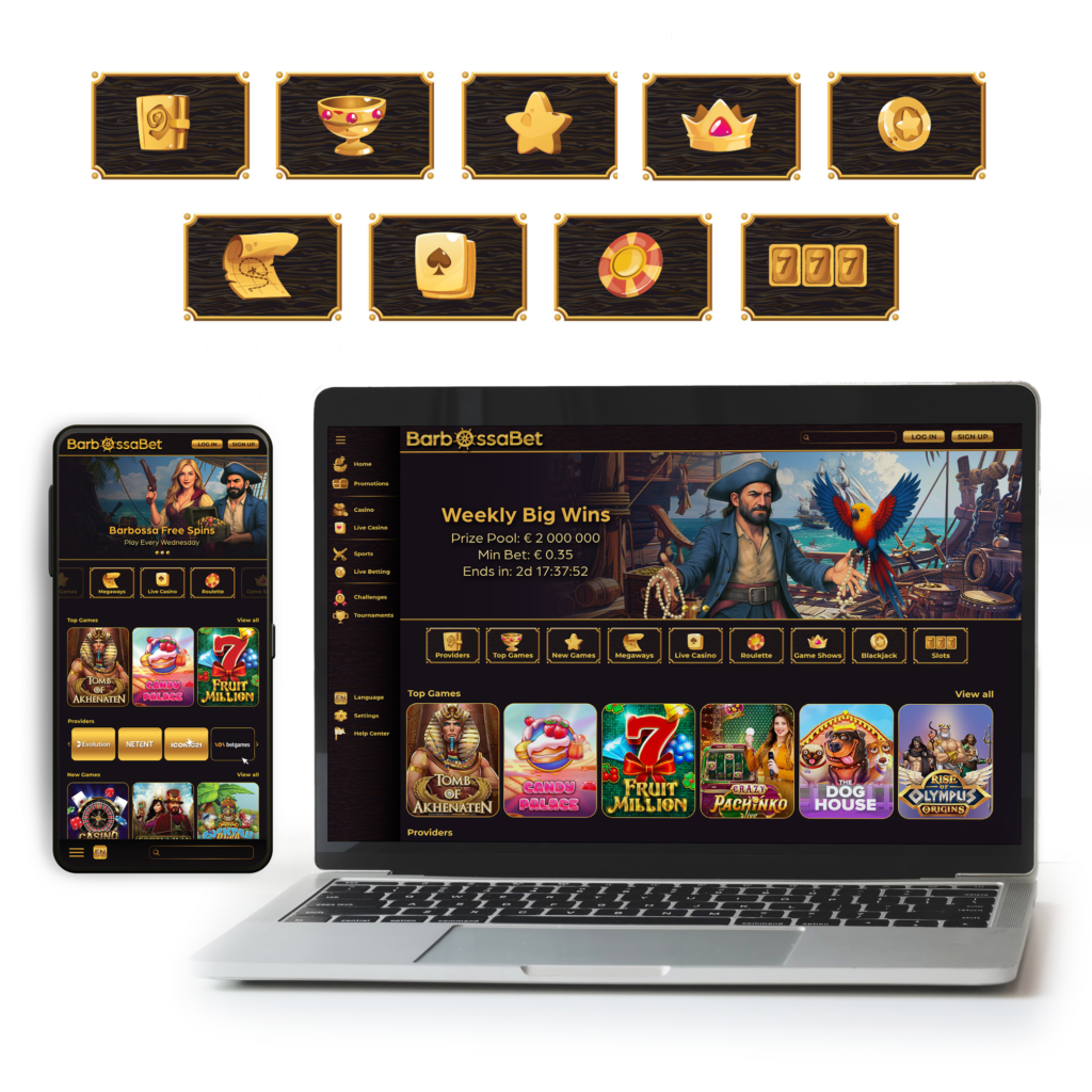
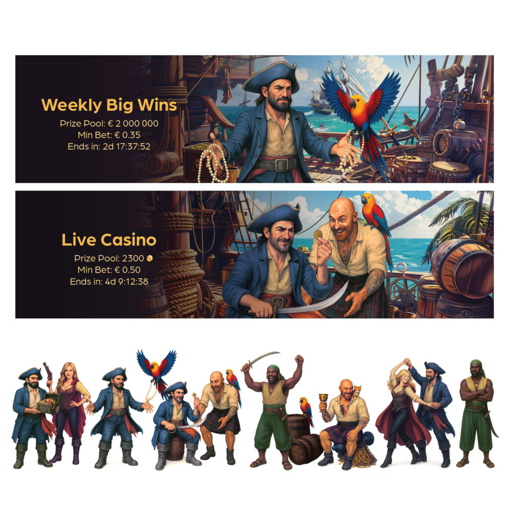
A complete visual identity developed for BarbossaBet, an online betting and gaming platform. The project included logo design, website design, and a range of supporting visual assets, all created to establish a bold and recognizable brand presence. A rich gold color palette plays a central role in the identity, evoking luxury, excitement, and the anticipation of a big win. The overall design combines a premium aesthetic with a dynamic and engaging visual experience.

Elite Figure skating Club
A visual identity created for Elite Figure Skating Club, inspired by the elegance, movement, and precision of figure skating. The logo features flowing lines that resemble the delicate traces left by skate blades on the ice, while a cool blue color palette reinforces the connection to the frozen surface. For the club’s apparel, the graphic elements were adapted into rhinestone designs, adding sparkle and reflecting light with every movement, capturing the grace and dynamic beauty of the sport.


Fit Cash
A logo concept developed as part of a pitch for a Bulgarian company offering quick and accessible loans. The name Fit Cash reflects the idea of flexible financial solutions tailored to individual needs, emphasizing that everyone can find a loan that fits their circumstances. The branding concept focuses on communicating simplicity, accessibility, and a personalized approach to lending.


Bulgarian Jewry Heritage Center – Jaffa
A logo design created for the Bulgarian Jewry Heritage Center in Jaffa, celebrating the shared history and lasting connection between the Jewish communities of Bulgaria and Israel. The concept brings together three meaningful symbols: the Star of David, representing Jewish identity and heritage; the rose, an iconic symbol of Bulgaria; and two joined hands, expressing unity and the enduring bond between the communities. The design honors both those who emigrated to Israel after World War II and those who remained in Bulgaria, reflecting their shared roots, cultural heritage, and strong connection across generations.


Bulgaria Polyclinic
A logo design created for Bulgaria Polyclinic, a well-known medical center located in the heart of Sofia. The concept draws inspiration from the universally recognized medical cross, preserving its strong association with healthcare while reinterpreting it through a modern and refined visual approach. The result is a clean, contemporary identity that communicates professionalism, trust, and care while maintaining an immediate connection to the medical field.


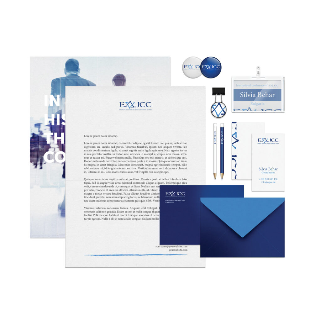
EAJCC
A logo design created for the European Association of Jewish Community Centers (EAJCC), selected through a competition among designers from Jewish communities across Europe. The concept incorporates the Star of David, emerging naturally from the letter A, creating a distinctive symbol that connects the organization’s initials with Jewish identity and heritage. The blue and white color palette reinforces this connection, referencing the colors of the Israeli flag while maintaining a clean and contemporary visual identity.


Bulgaria knows and can
A logo design created for Bulgaria Knows and Can, an educational initiative by a global technology and consulting company, aimed at improving digital literacy and expanding job opportunities. The project provides basic computer skills training to people from diverse backgrounds with limited access to technology. The logo combines an owl, symbolizing wisdom and knowledge, with a computer mouse, representing digital skills. Together, they create a distinctive visual identity that reflects the initiative’s mission to empower people through education in an increasingly digital world.


75 Years
A commemorative logo created to mark the 75th anniversary of the rescue of Bulgarian Jews during World War II. The design embraces simplicity and elegance, creating a timeless visual identity that reflects the significance of this historic event. A clean and refined approach conveys a sense of dignity, remembrance, and gratitude while honoring an important chapter in Bulgarian Jewish history.


